/Afbeeldingen/Mysolution%20Logo.png?width=150&height=113&name=Mysolution%20Logo.png)
Who is this feature for?
This feature is useful for all users.
Benefits at a glance
- The look & feel of workflow tiles has been updated with rounded corners and a redesigned layout for a fresh appearance.
- Enhanced filtering options allow you to quickly switch between 'My', 'Team', or both. You can now always search across accounts, jobs, people, users, business labels, and teams in a single query.
- Workflow tiles can now be grouped, making it easier to organize similar tiles.
- Action buttons can be created to directly launch a flow or send an SMS to a person from a workflow tile.
- If you’ve added a candidate to your query, the detail view lets you instantly see their resume, profile card, and activity timeline.
How it works
The first noticeable change is the design. The tiles have a slightly different appearance. The setting that previously displayed the number of rows in green, orange, or red is no longer applied.
Workflow tiles can now be grouped into different categories, such as Recruitment, Back Office, and Sales. Select a specific group or choose All. If no workflow group is assigned to a tile, this field will not be displayed.
Filtering options have also been improved. You can now easily filter by 'My' and/or 'Team'. The 'Team' button is only visible if you are part of a team or team group. If you have authorization for all teams or team groups, the 'Team' button will not appear.
You can now also filter across multiple objects:
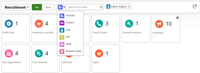
Select the object you want to filter on and then search for the relevant record. You can now also add multiple records of the same type.
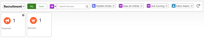
Each of the selected filters is applied in combination with the others. The only exception is 'My' (user) and 'Team', which are used alongside each other.
For example, within the available tiles, the search will filter for the account "Madden Media" and the persons Klaas de Vrienkx or Jack Gunning and the user Edwin Adams or Team Utrecht.
To apply filters, they must be correctly defined in the workflow definition.
Workflow tile setup
Workflow tiles are configured via Custom Metadata Types under Workflow Definition. Different variants exist, each launching a specific follow-up screen:
- A query with the object msf__Job_Application__c displays an application overview per job.
- A query with the object msf__Placement__c shows a standard overview of placements.
- A query with the object msf__Interface_Log__c presents a standard overview of the integration log.
Of course, you can also create workflow tiles for other objects, such as Absence, People, and Accounts. Additionally, for applications and placements, you can customize the standard overview by selecting the fields displayed in the view.
Improvements for this category of workflow tiles
- If a person is included in the query, you can now switch between the list view and the detail view by default. At this time, it is not yet possible to configure the individual tabs displayed in the detail screen.
- You can define custom actions based on the results in the tile. For example, you can launch a screen flow to send an email to a candidate, send a questionnaire, or send an SMS. The action button is only activated when you select a record from the list. If the workflow action is only applicable to a single selection, the button will disappear when multiple records are selected.
- In the standard placement overview, you can open the checklist from the checklist status column. This allows you to directly add a document to an incomplete checklist.
- You can search within the visible columns of your overview. By default, the name field of a reference field is available. If data encryption is enabled on a person’s name field, no results will be displayed when searching for the candidate's name.
- The title bar of the screen now displays the label of the workflow definition. If a help text is available, it will also be shown in the title bar.
- These overviews now support hyperlink fields, number fields, and images.
- Finally, by right-clicking on a tile, you can open the overview in a new tab.
Setup
During the installation of the new release, all necessary elements have been automatically converted to ensure everything continues to function as before. To take advantage of the new features, follow the configuration steps below.
Feature Implementation Time (FIT)
- Rapid Implementation (1-3 hours)
Configuration/Setup Instructions by Component
Permissions/Profile
To work with workflow action settings, you first need to adjust the permissions. Administrators must be given full access to the Workflow Action Settings object, while users only need read access.
Custom Metadata Types
To categorize existing tiles into groups or translate them, you need to make adjustments in Custom Metadata Types, Workflow Definition. Click to open this type and modify its properties.
- Adjust the page layout by adding the new fields Workflow Group and Expanded List Fields to Display to the page, and removing the List Fields to Display (Old) field.
- During installation, all values from List Fields to Display (Old) have been transferred to the new Expanded List Fields to Display field. This field allows more characters, enabling the addition of more column fields.
Now you can start modifying existing and new Workflow Definition records. Assign the correct value to the Workflow Group field for each definition. Tiles with the same description will then be grouped together. If you want to add more column fields, use the Expanded List Fields to Display field.
Workflow Action Settings
New Workflow Action Settings can be created via the App Launcher. The following fields are important:
- Workflow Name: The API name of the Workflow Definition (Custom Metadata Type) where the action should be executed.
- Action: Select 'Send SMS' if you want to send an SMS. If you are calling a flow, leave this field empty.
- Order: Determines the left-to-right order. If more than nine action buttons are available, the rest will be accessible via the "..." button.
- Allow Multiple Selection: Indicates whether multiple records can be selected to execute the action.
- Description: Enter the description. If you want to use a translatable label, apply the correct syntax, such as {!$Label.Example}, where "Example" is the standard label name. For a full guide on setting this up, refer to this document.
- Flow: Enter the API name of the flow you want to launch.
- Screen Flow Width: Select the screen size.
- Icon Package & Icon: Choose an icon from the available list: Lightning Design System Icons
- Icon Color: Optionally set a color for the icon using its hexadecimal value, such as #000000 for black.
(Screen) Flows
By default, the variable 'recordId' is populated for the selected records. Further processing must be handled within the flow itself.
🔗 Here you can find all the features from the February 2025 Release.